Client work · 2026
zman
English for Sorani Kurdish speakers
Brand identityApp iconUI/UX designBrand guidelinesDesign tokens

A new identity and interface for an app that teaches English to Sorani Kurdish speakers: one round stroke with a dot inside it, a dark icon with a single point of colour, and sixteen iPhone screens that read right to left.
- Client
- zman, language app
- What we did
- Brand identity, App icon, UI/UX design, Brand guidelines, Design tokens
- Typefaces
- Noto Kufi Arabic (kurdish), SF Pro (latin)
- Year
- 2026
One dot makes the name.
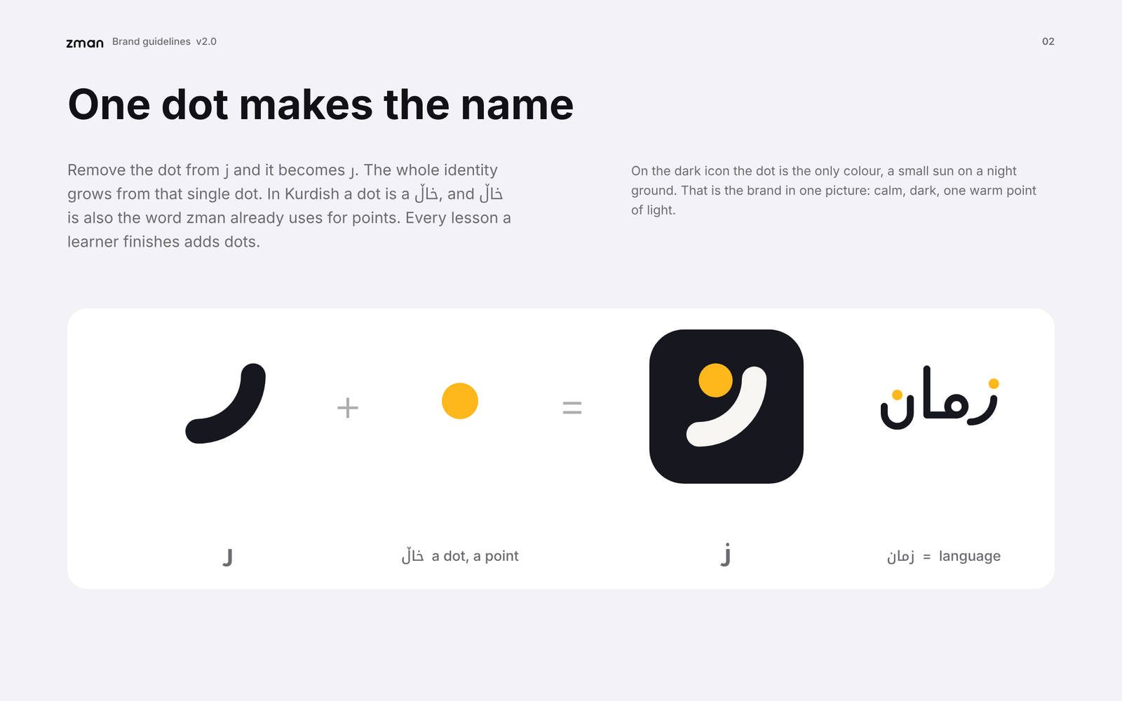
Take the dot off the Kurdish letter ز and it becomes ر. So the logo is ز drawn as one round stroke with its dot held inside the curve. In Kurdish a dot is a خاڵ, the same word the app uses for the points a learner earns.
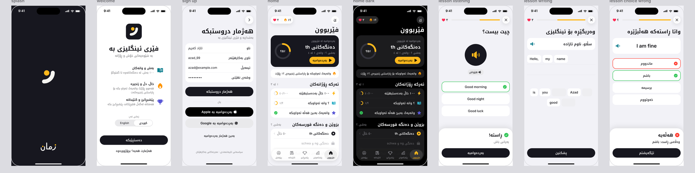
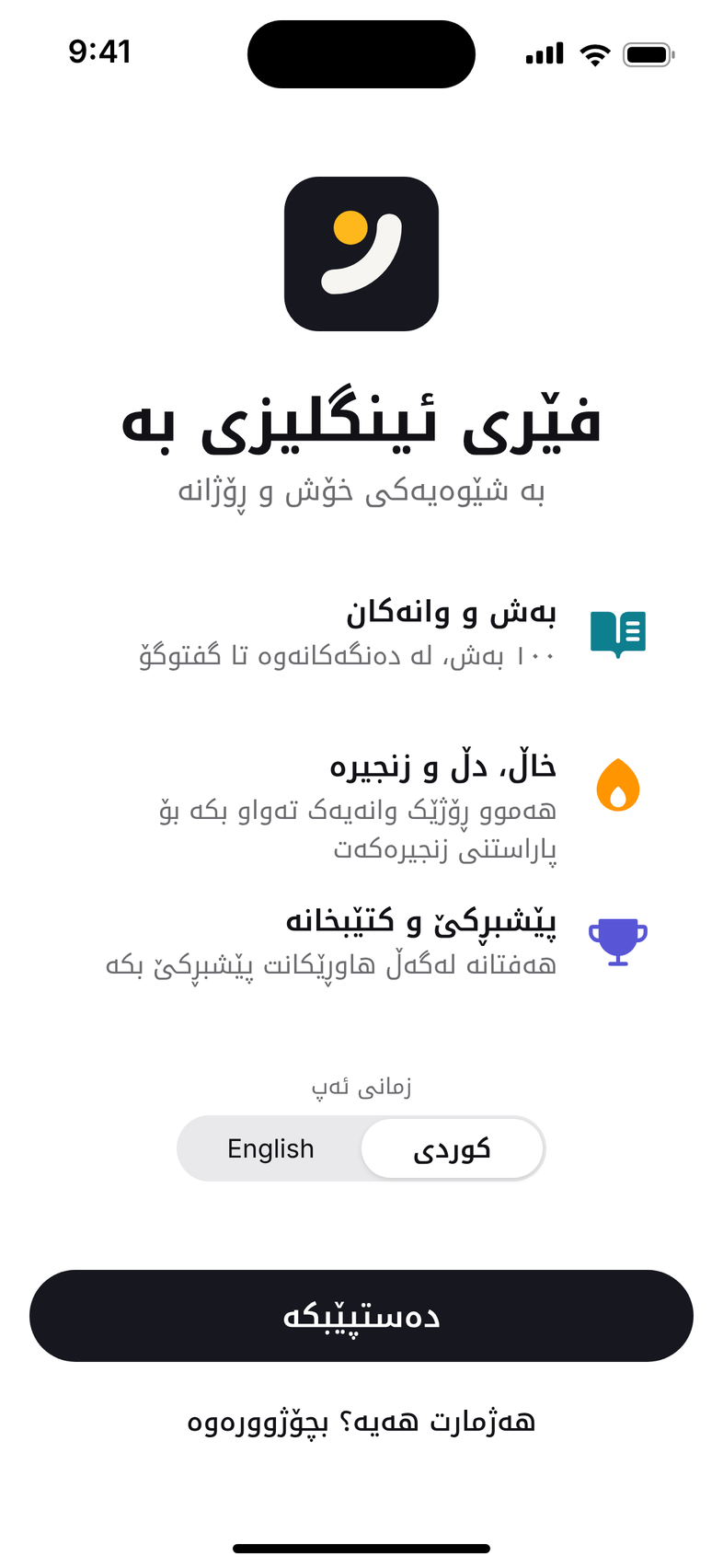
On the icon the dot is the only colour: one warm point on a dark ground. The interface follows the phone it lives on, with grouped lists, large titles and capsule buttons, and it puts Kurdish first, from right to left, with English as the thing being learned.

Everything we delivered.
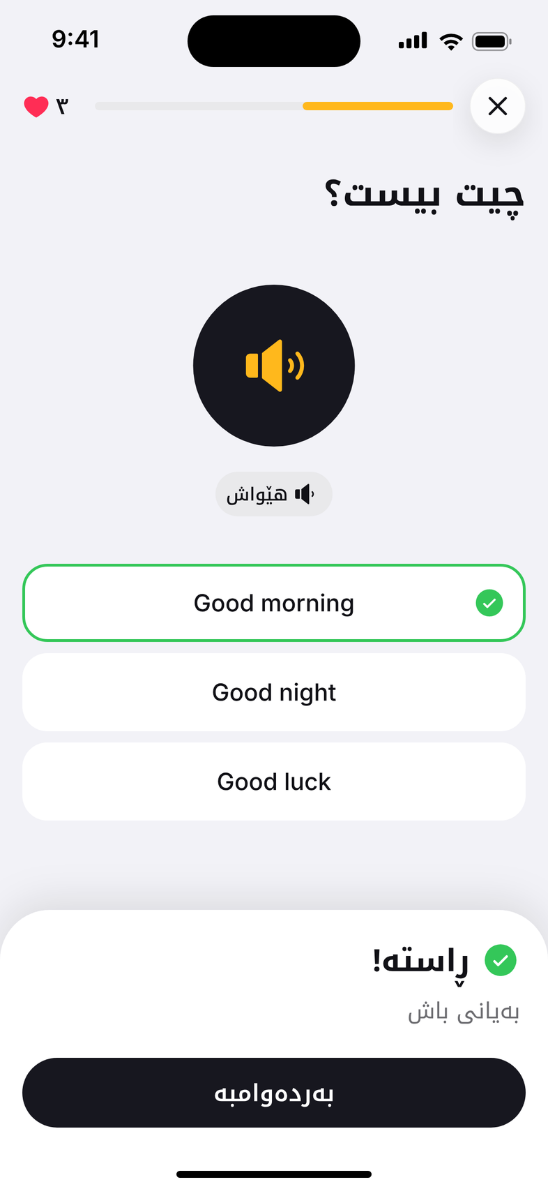
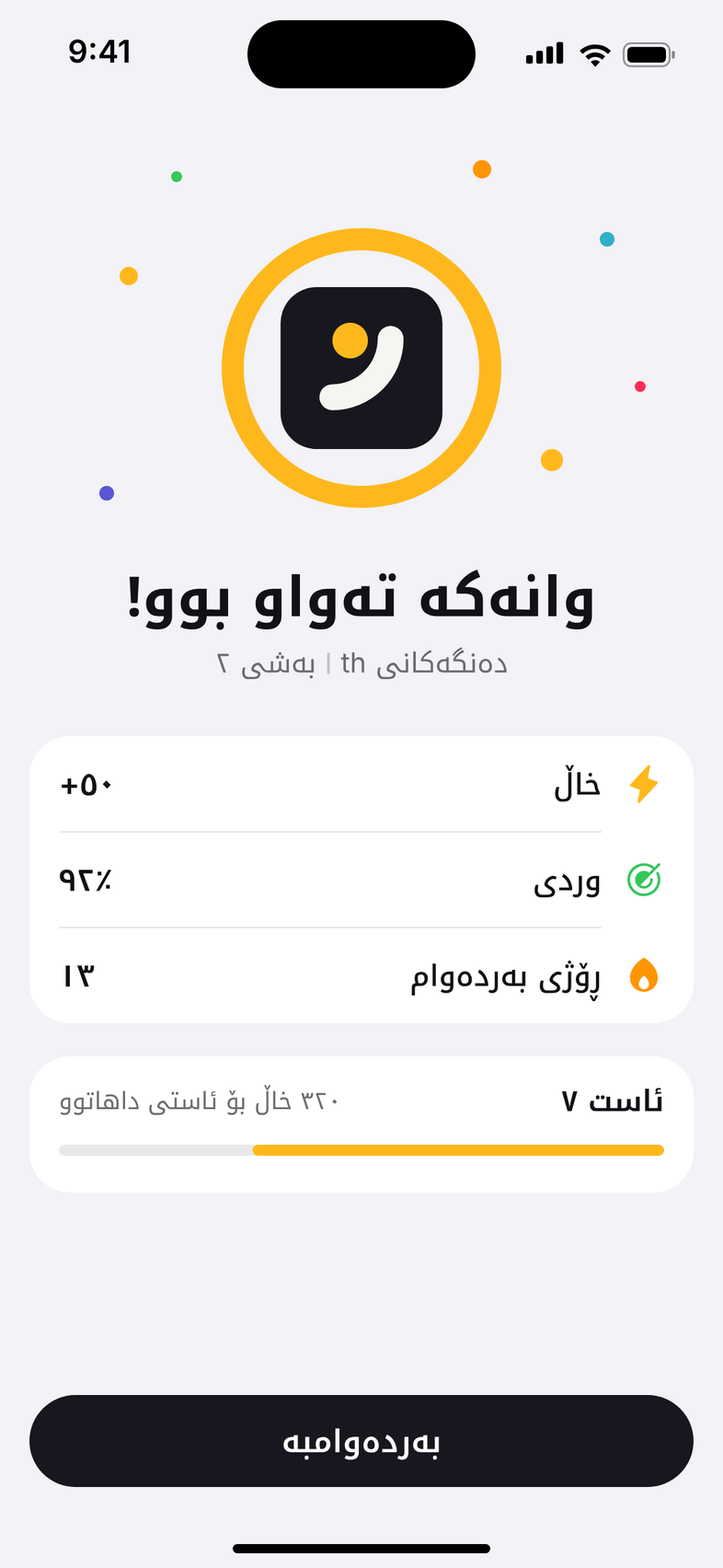
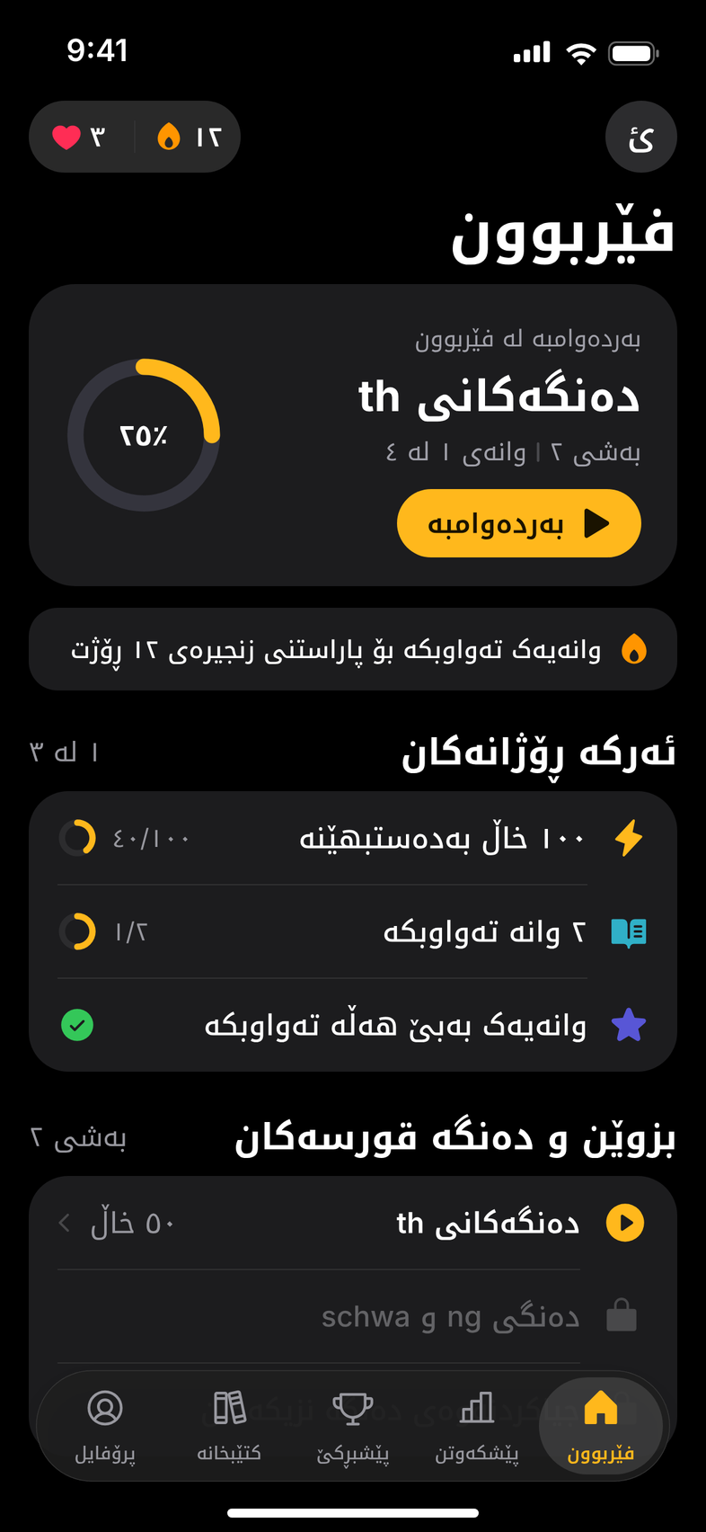
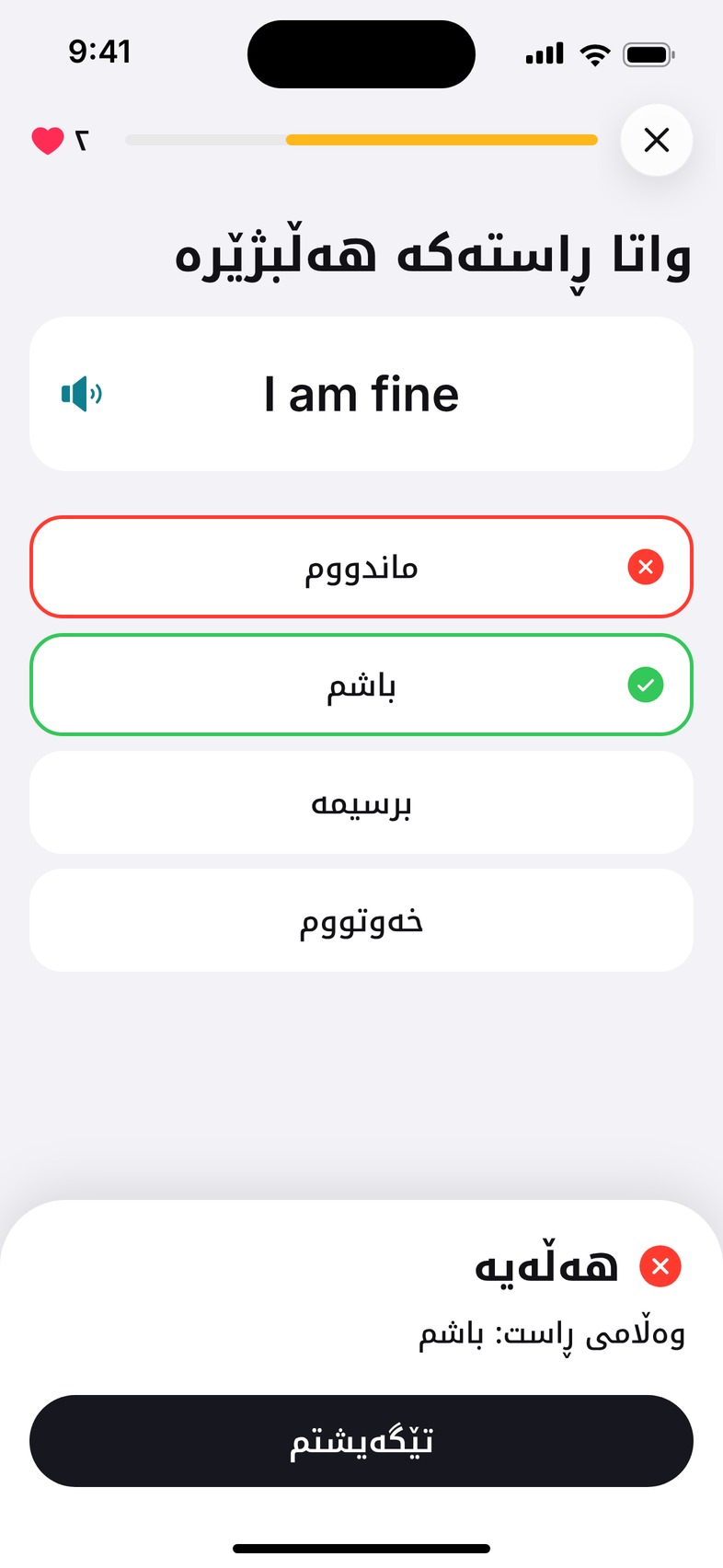




- 01
The mark
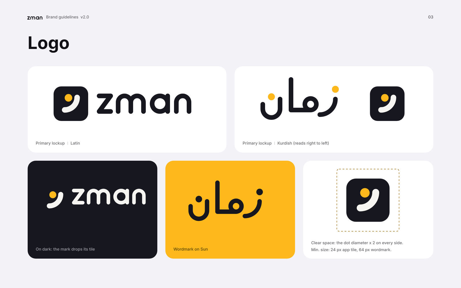
The letter ز as a quarter-circle stroke with its dot inside the curve, for dark, light and yellow grounds and in one colour.
- 02
Wordmarks and lockups
A geometric زمان and a Latin zman, with Kurdish, Latin and stacked lockups. 21 logo files, each as SVG and PNG.
- 03
App icon
iOS default, dark and tinted versions, an alternate in Sun yellow, the Play Store icon and the Android adaptive foreground.
- 04
Sixteen screens
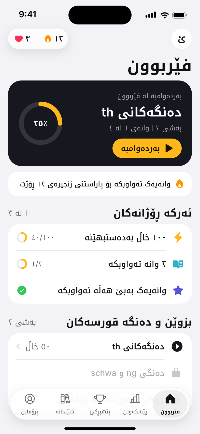
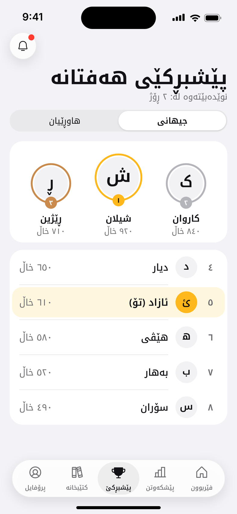
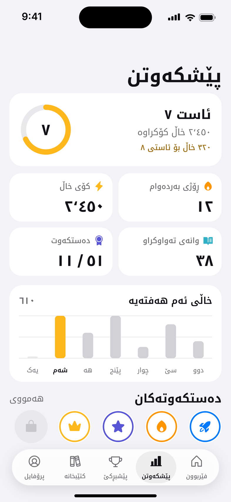
Splash, welcome, sign-up, home in light and dark, five kinds of lesson, the league, progress, library and profile, drawn at iPhone size.
- 05
Components
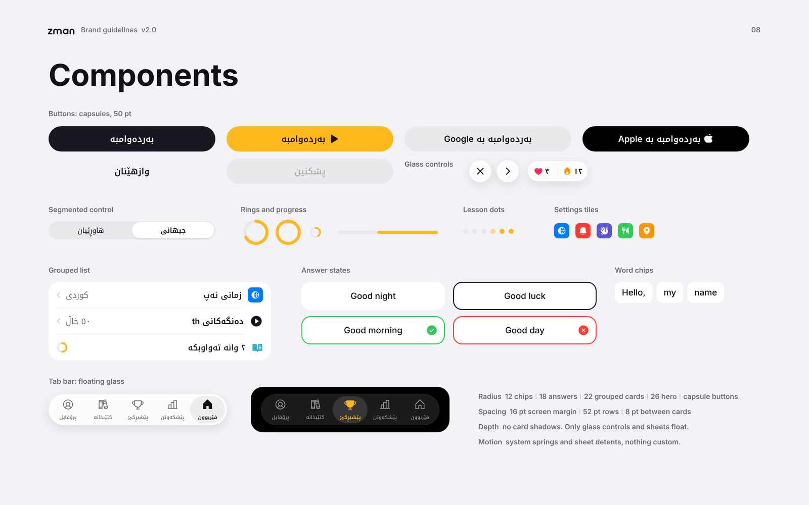
One sheet of the parts every screen shares: capsule buttons, grouped lists, answer states, rings and the floating tab bar.
- 06
Colour system
Ink and Sun for the brand, the phone’s own greys for surfaces, and system colours that carry meaning in a lesson.
- 07
Typography
Noto Kufi Arabic for Kurdish and the system font for Latin, with a size and weight for every role.
- 08
Brand guidelines
Ten pages, from the idea behind the dot to the lesson loop, as SVG, PNG and one PDF.
- 09
Design tokens
Colours, type and radii as JSON and as a Dart file, ready for the Flutter build.
Ten pages for the whole brand.
The guideline starts with the idea, one dot, then sets out the logo and how to use it, the app icon, colour, type, components and the lesson loop. It comes with the design tokens, so the build starts from the same values as the drawings.
Brand guidelines, the service